In the first quarter of 2025, I was approached by the President of the Delta Chi Lambda chapter of Alpha Phi Alpha Fraternity, Inc., to complete the task of redesigning the citywide website. I was honored to accept because I’m a member of this particular chapter of the first Historically Black Greek Letter Organization (BGLO), and I believe in the mission we all share.
Read more about Alpha Phi Alpha Fraternity, Inc. here.
Project
Website Redesign
Client
Alpha Phi Alpha Fraternity, Inc. – Delta Chi Lamba Chapter
What We Did
Front-end Web Development, Graphic Design, Site Redesign
Making Changes
As a designer, handling a task like redesigning a website comes with more than just getting straight to the fun part of making art. It takes a bit of research to know your client, what’s important to them, their brand identity, their target audience, and the list goes on. Thankfully, I know this client and we have the same mission statement, bylaws, and brand guidelines to abide by. So, I took advantage of that and made design adjustments based on the National HQ website for Alpha Phi Alpha.
Below, you’ll find a side-by-side comparison of the old site design (left) vs the new one (right).
Simple is not always easy.
See the full website: alpha-milwaukee.org
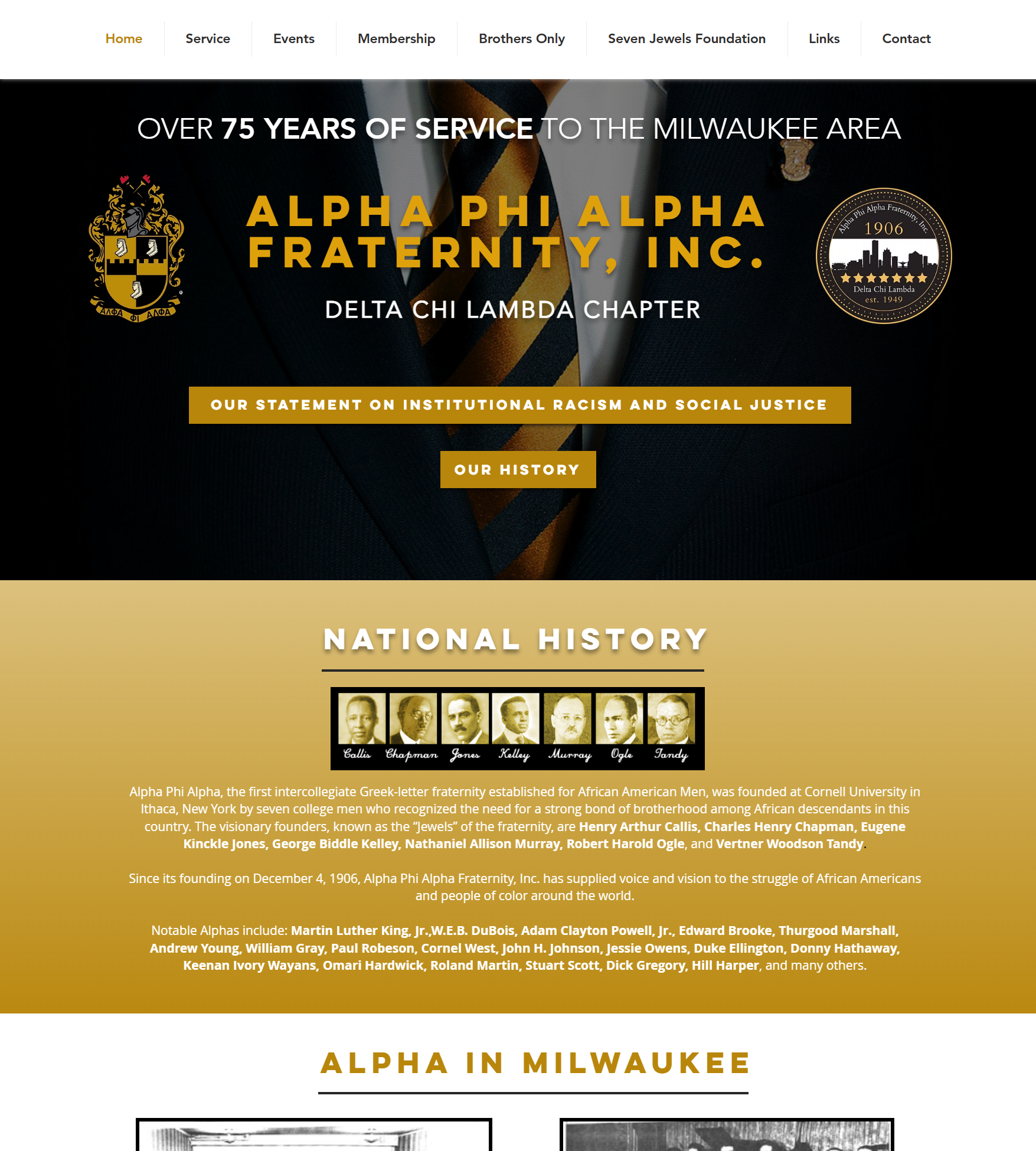
My UX design experience taught me that, to users, buttons need to look like buttons. So, that was one of the first things I cleaned up on every page. After that, I matched our site colors to those used on the national website to reflect consistency in the overall brand, as chapters are just branches attached to the same tree.
Alpha Phi Alpha’s colors are Black and Old Gold.
This meant changing roughly 60% of the entire site’s color palette, which resulted in a more vibrant color palette overall, matching the fraternity’s current brand. Incorporating typography into the process was also necessary, adding visual hierarchy between headers, subheads, and body copy.
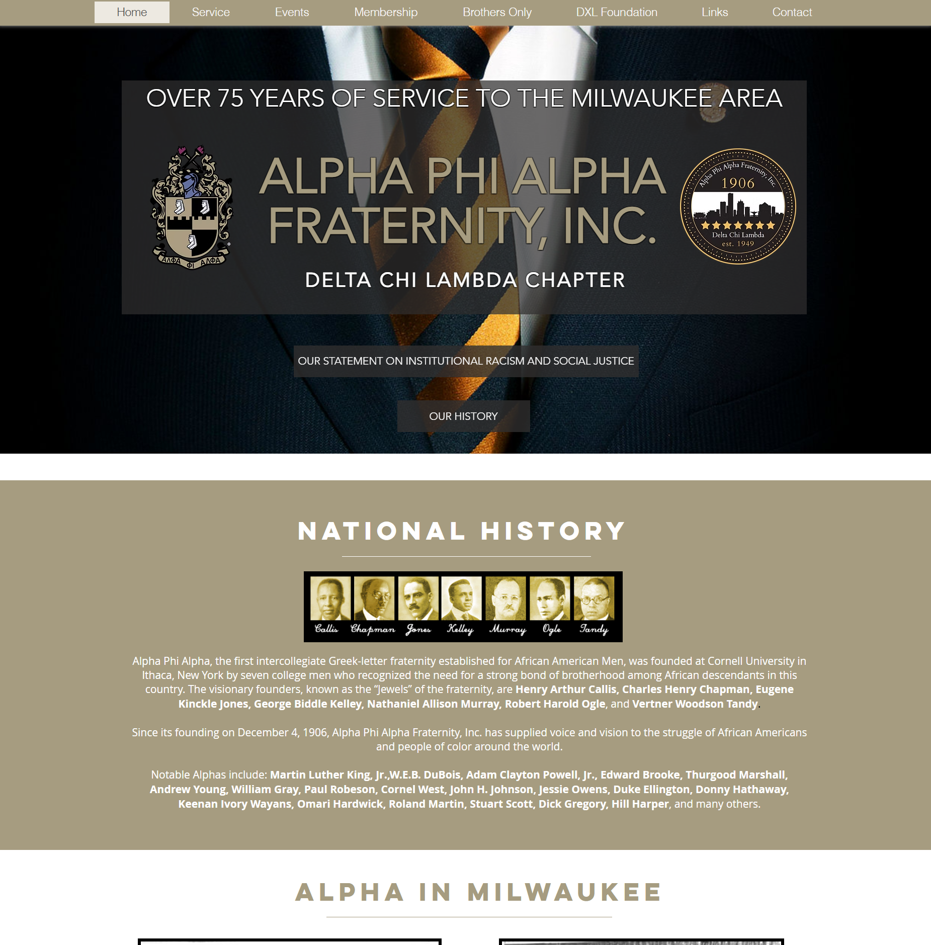
The Old Site
I also noticed some long-lasting functionality issues and areas of opportunity for replacing elements that weren’t as aesthetically pleasing as they could be (i.e., the iframe subscription field in the second image below). Legibility is super important, so I made the two columns of text at the bottom of the index left-aligned because it reads better that way.


The New Site
We kept the same content management system (CMS), which made the redesign process run smoothly. The previous site was made with Wix, which I’ve found to be an intuitive CMS that has greatly improved over the last decade. Given my experience with others like Webflow, WordPress (most-used), Drupal, and Joomla, this was a pleasant surprise.


One of my favorite changes is the Events page, because the calendar gives more information in a modular layout. Instead of having a typical grid (not saying there’s anything wrong with a conventional design), users will see the most relevant events in a card system with easy-to-read information front and center. I’m always happy to improve the user experience since I try to make things that I enjoy using.