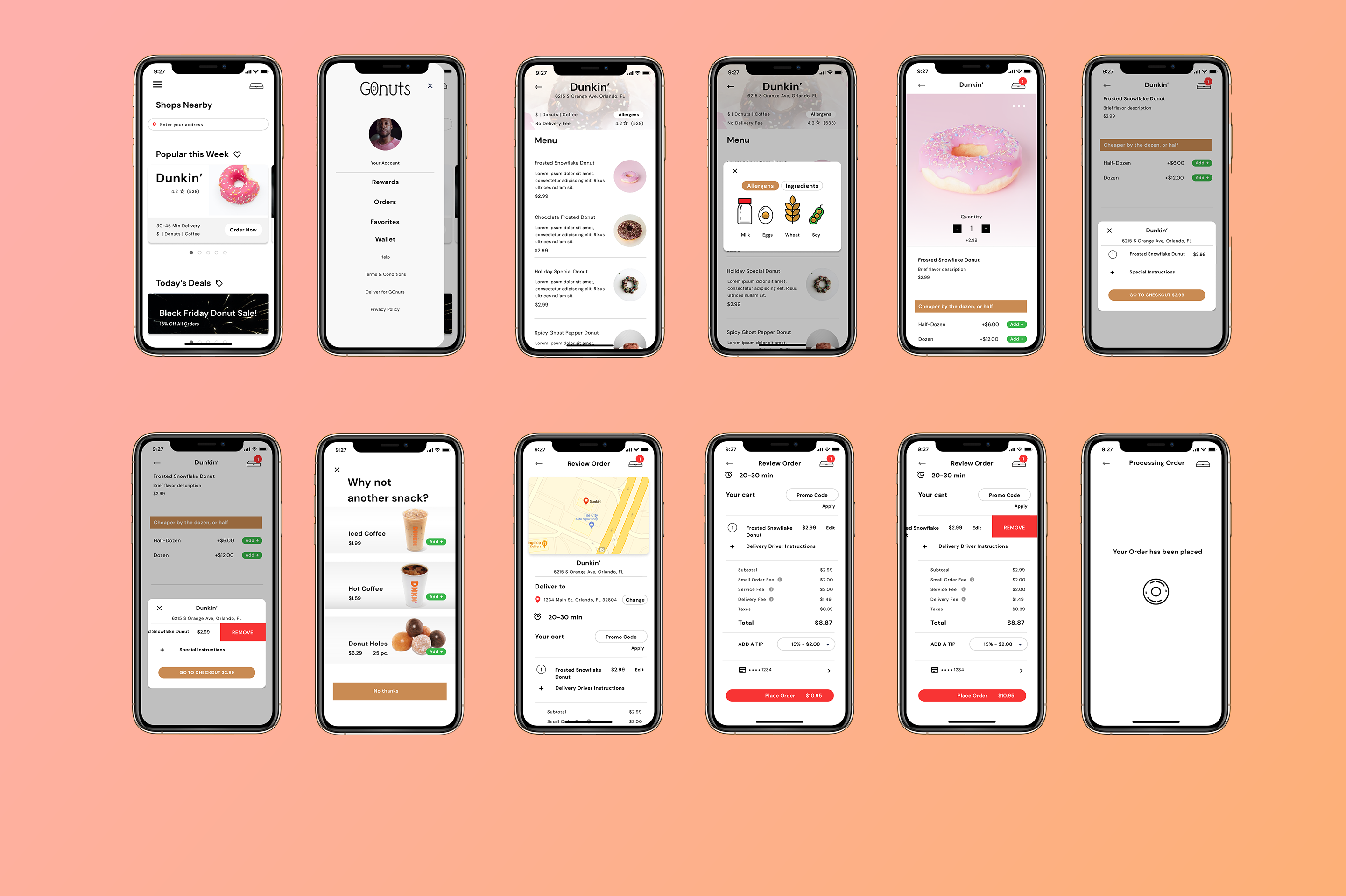
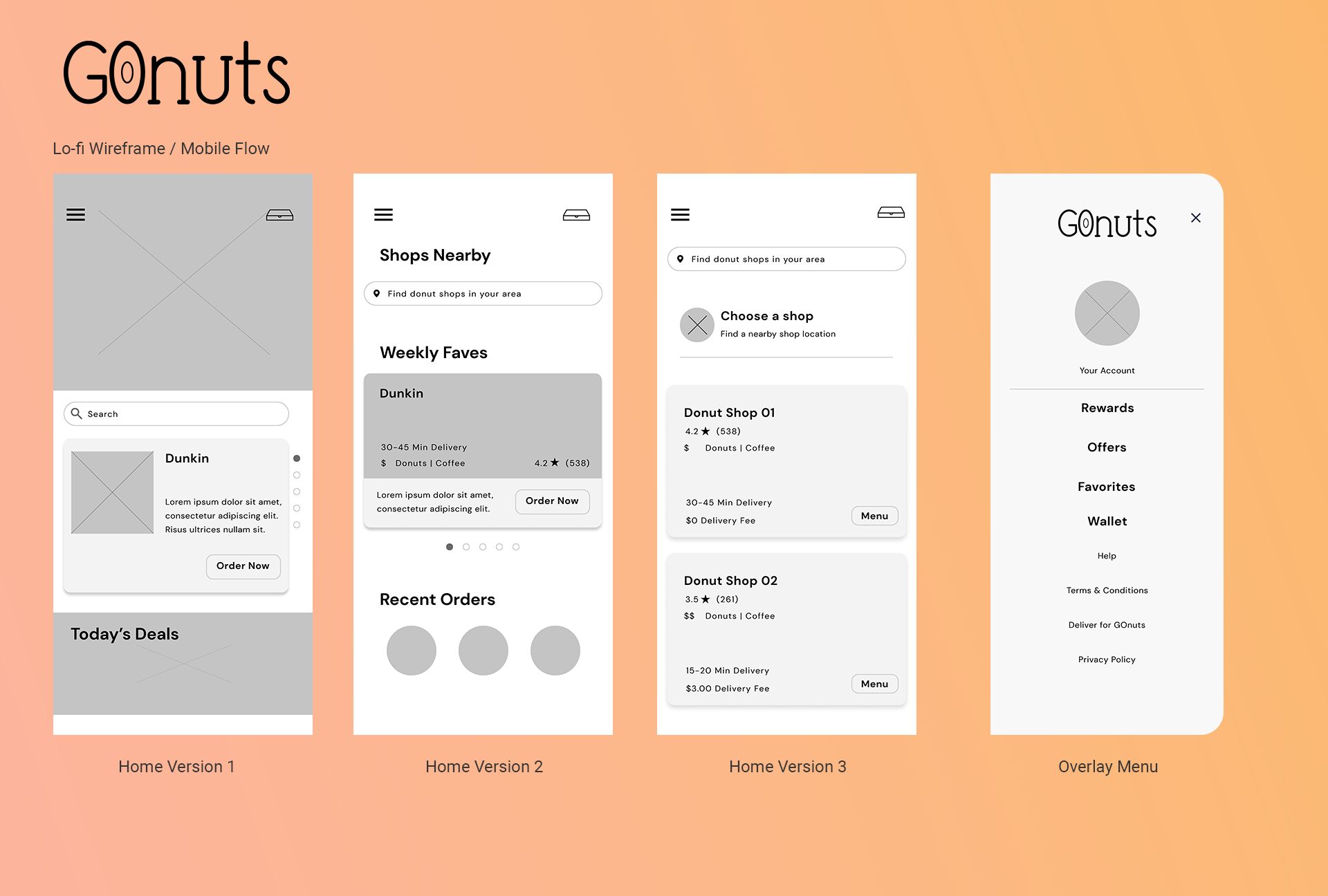
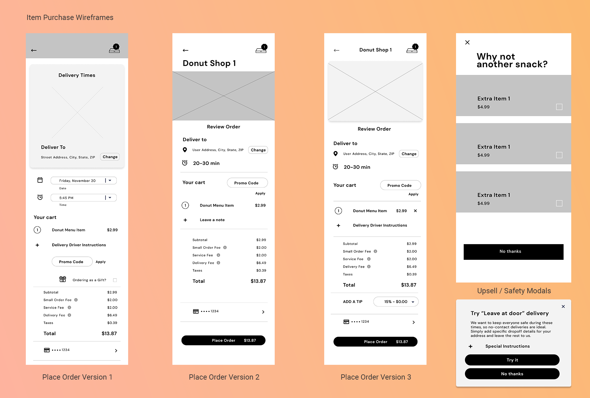
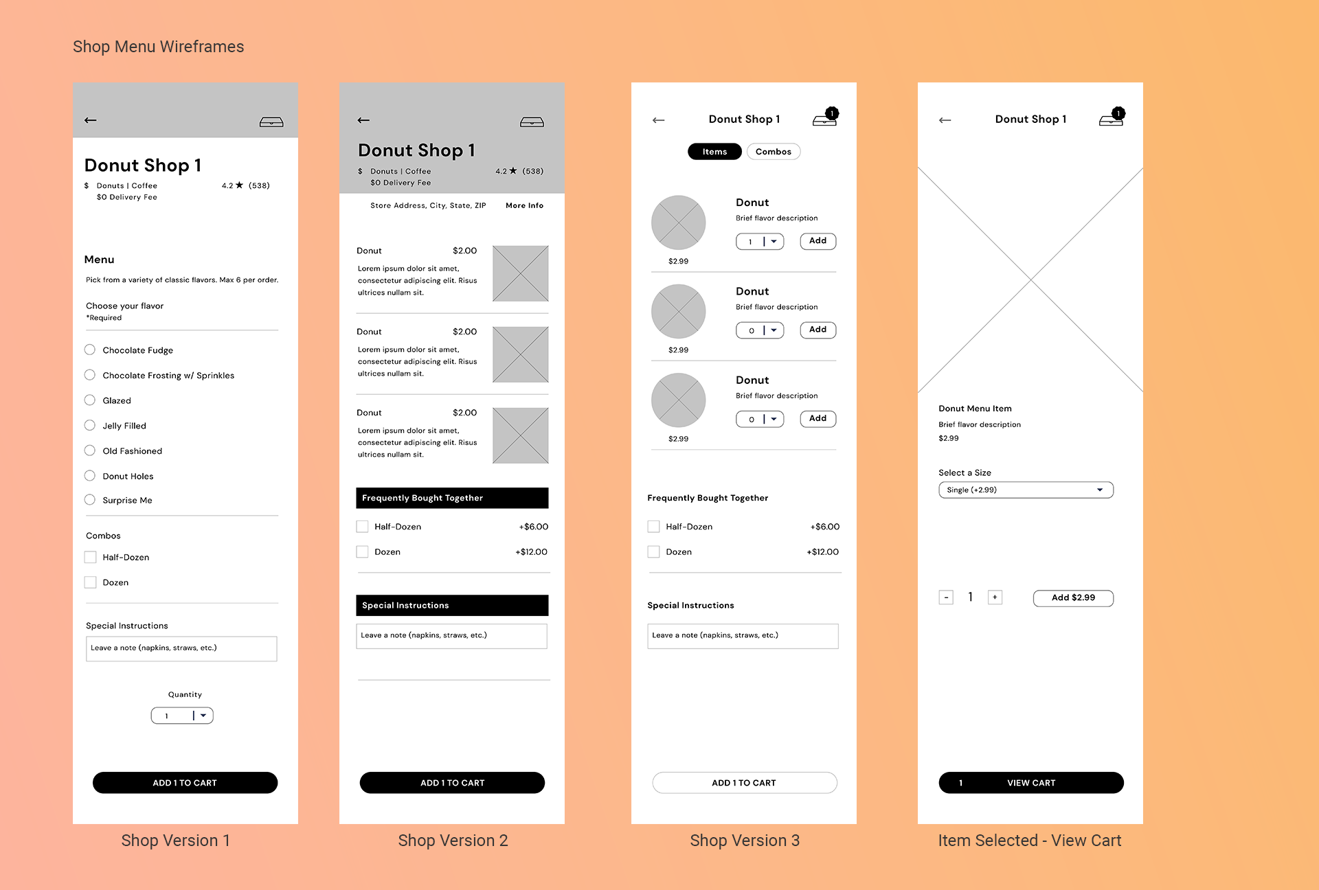
I was tasked with creating a donut delivery service app to the likes of Uber Eats within 72 hours as part of a UI/UX Design challenge to assess my skills. It all started with my usual design ritual: headphones on, my favorite original motion picture scores keeping me motivated, a Peach Red Bull to my left, and my grid sketchbook. Getting my most generic ideas out of the way first with super rough, messy wireframes on paper helped me budget my time more effectively so I wasn’t guessing halfway through the process.
Once all of that was complete, I drafted a user journey map with a cleaner set of wireframes, which ultimately led to the overall design as showcased below.
Project
UI/UX Challenge – Mobile Donut Delivery App
Software Used
Figma, Adobe Illustrator, After Effects, Premiere Pro
What I Did
UI/UX Design, Animation
Live Demo
Maximize this frame and navigate the concept for yourself.
Mobile Walkthrough
Animated GoNuts! App Demo
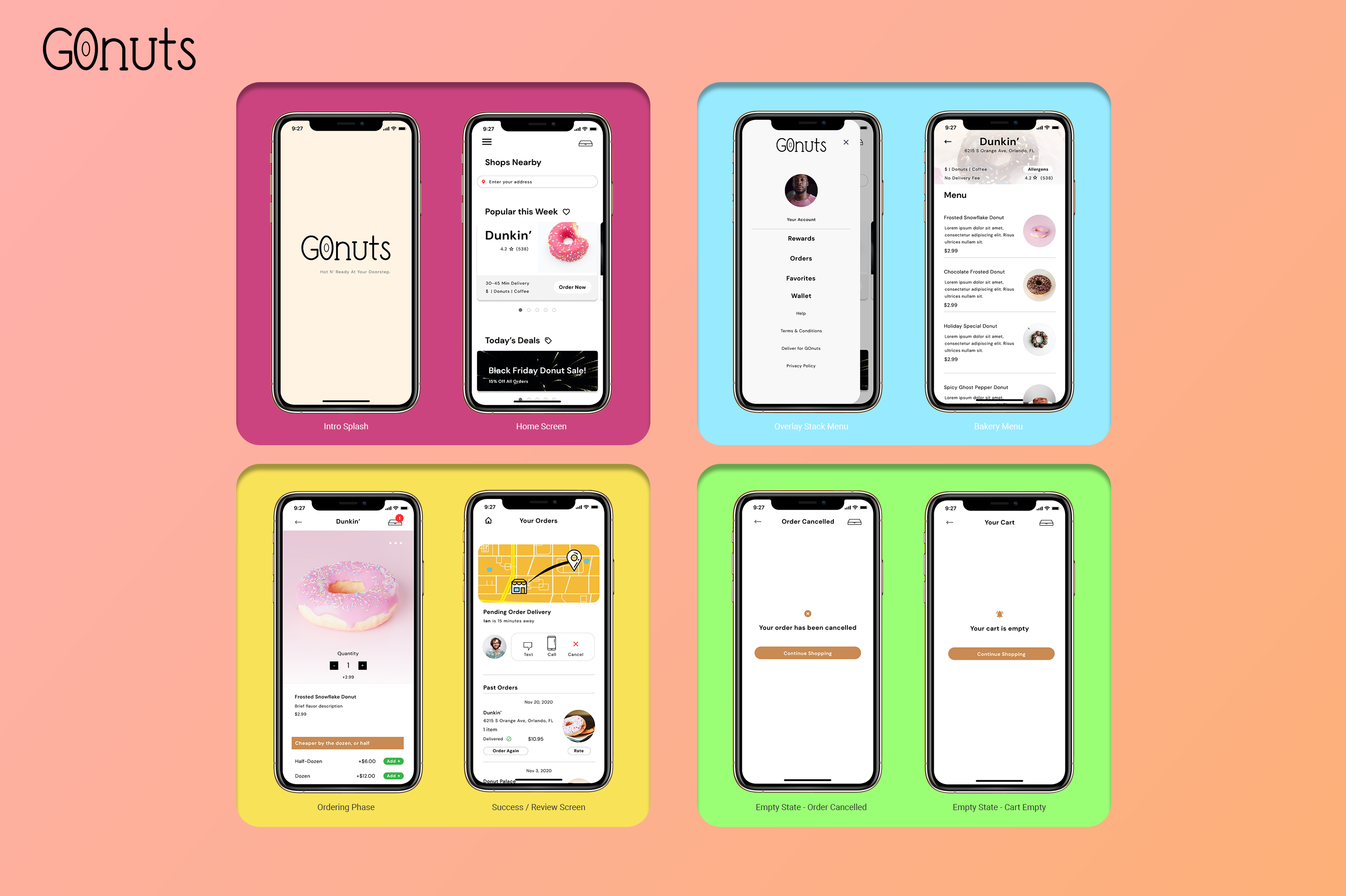
Mobile Flows
Wireframes and Mockups
Animation
Loading States
Custom Icons
Designed in Adobe Illustrator
I typically like to save time by using conventional icon designs we’re all used to, but for the GoNuts app, I wanted a few things to feel unique within that space (especially in regards to ingredients). These icons are mostly included in screens where the user would click based on their unique needs or interests (allergies and nutrition). Landing on a screen with these custom icons felt like a more personal experience than using something we’ve all seen before.

