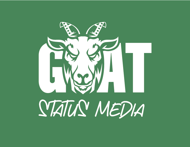
In Q1 of 2026, I was commissioned to develop a logo for a multimedia company called GOAT Status Media. Through professional video and photography, this sports media brand showcases young, talented athletes via highlight reels and interviews.
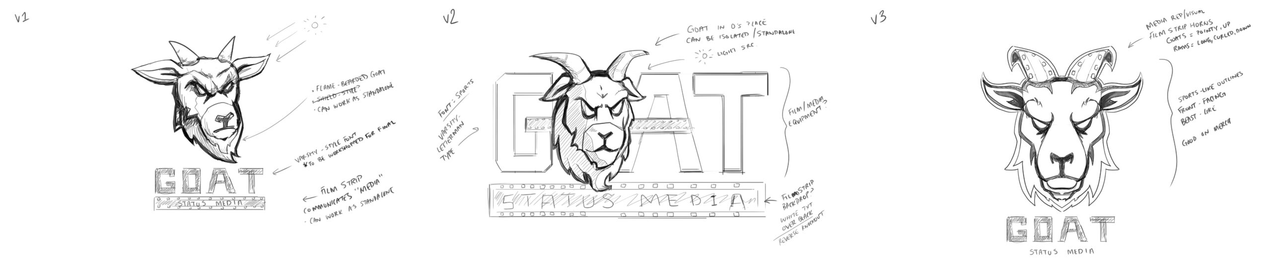
GOAT stands for “Greatest of All Time,” and my client was adamant that his logo would have that same energy in every application. My approach began with researching conventional sports logo design and the inclusion of expressive animals in them. This informed my decisions in preliminary sketches (as seen below) that I discussed early on with my client.
Project
Logo
Client
GOAT Status Media
My Work
Sketch, Logo, Design System
01: Sketching
As aforementioned, my design process begins with research and illustration, which is great for pruning the generic ideas that first come to mind. After meeting with a client about the brief, I take my notes to the drawing board (Wacom tablet) and produce some rough sketches. I typically keep going until I have at least three versions of the logo that we (the client and I) are okay with moving forward. As shown below, that’s exactly what I did. The client was most happy with version three.
The remainder of the video showcases the latest voiceover feature in the mobile app for users to edit their content.
Below, you’ll find more “How To” motion graphics I made for the Triller mobile app.
02: Vector Art & Iteration
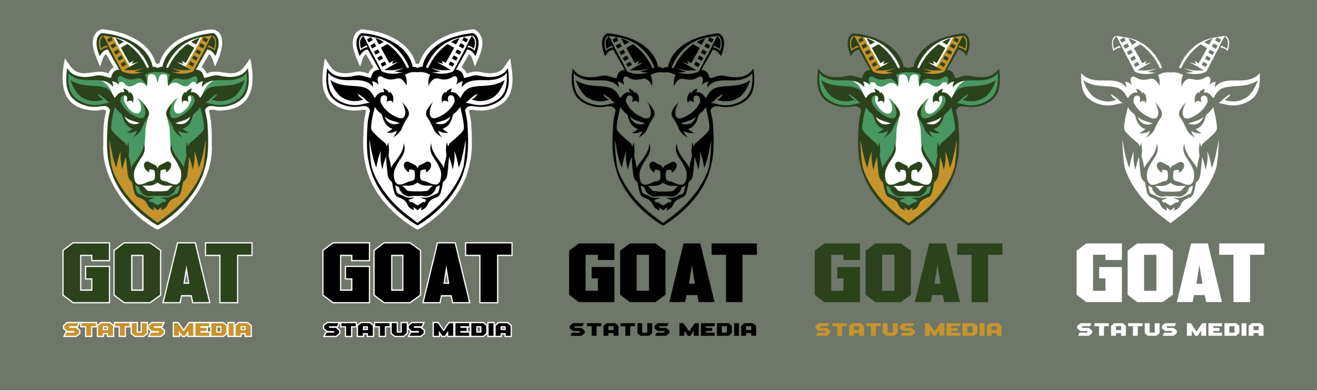
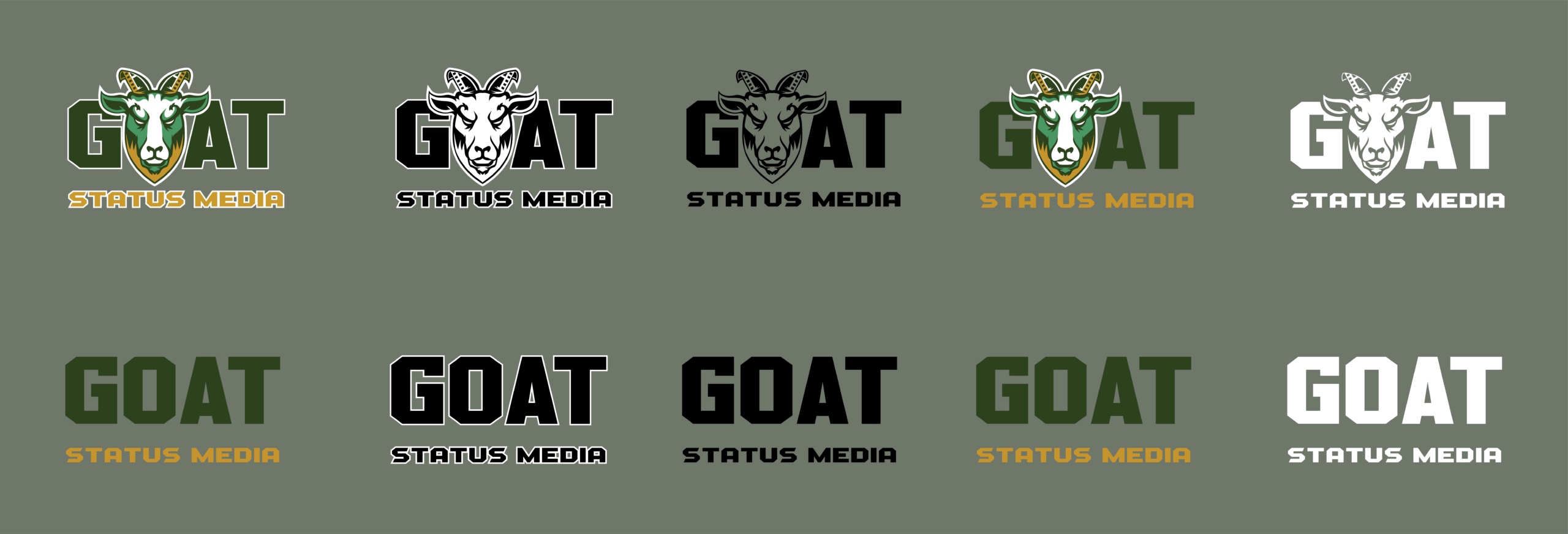
This logo went through many iterations to get to where it is today, which challenged me in fun ways and made me a better designer. Below is a gallery showing the initial rounds of the GOAT Status Media logo and how client feedback helped to smooth out the final result.


03: Review, Refine, Repeat
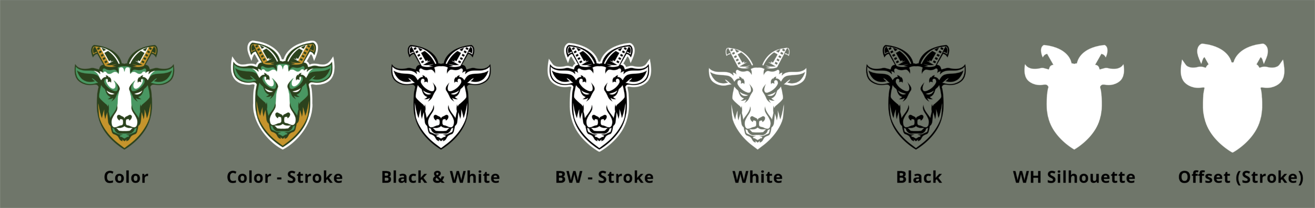
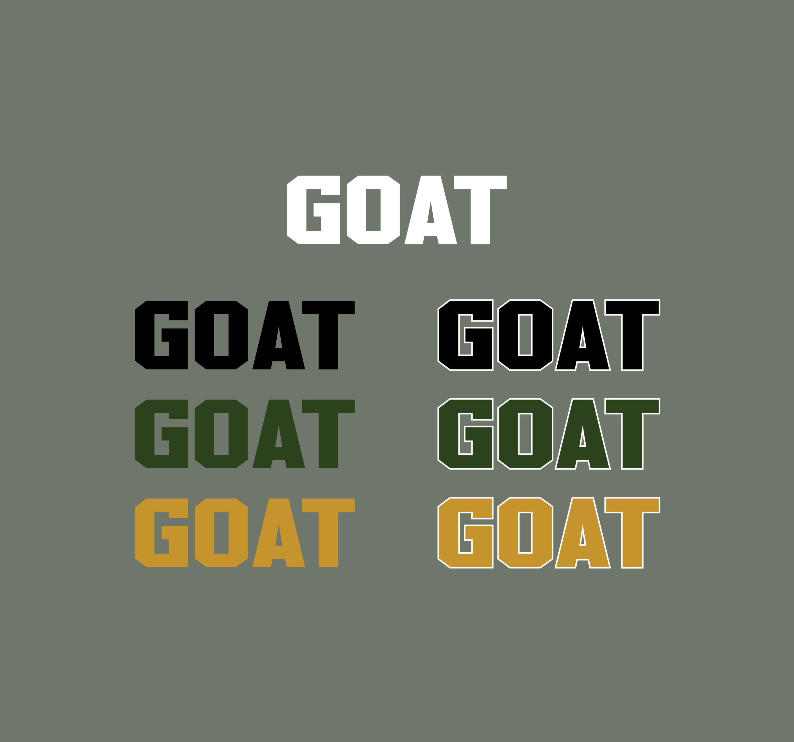
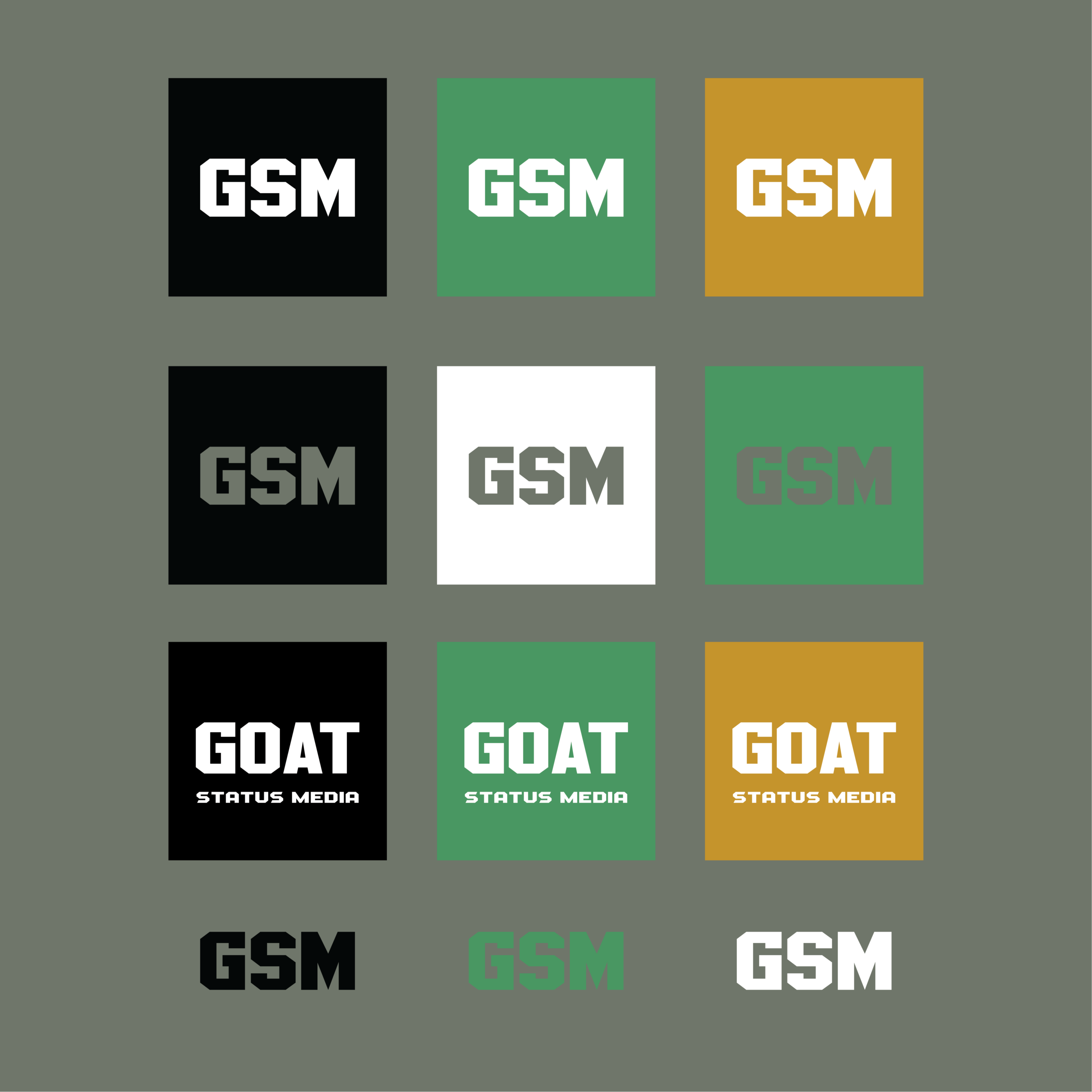
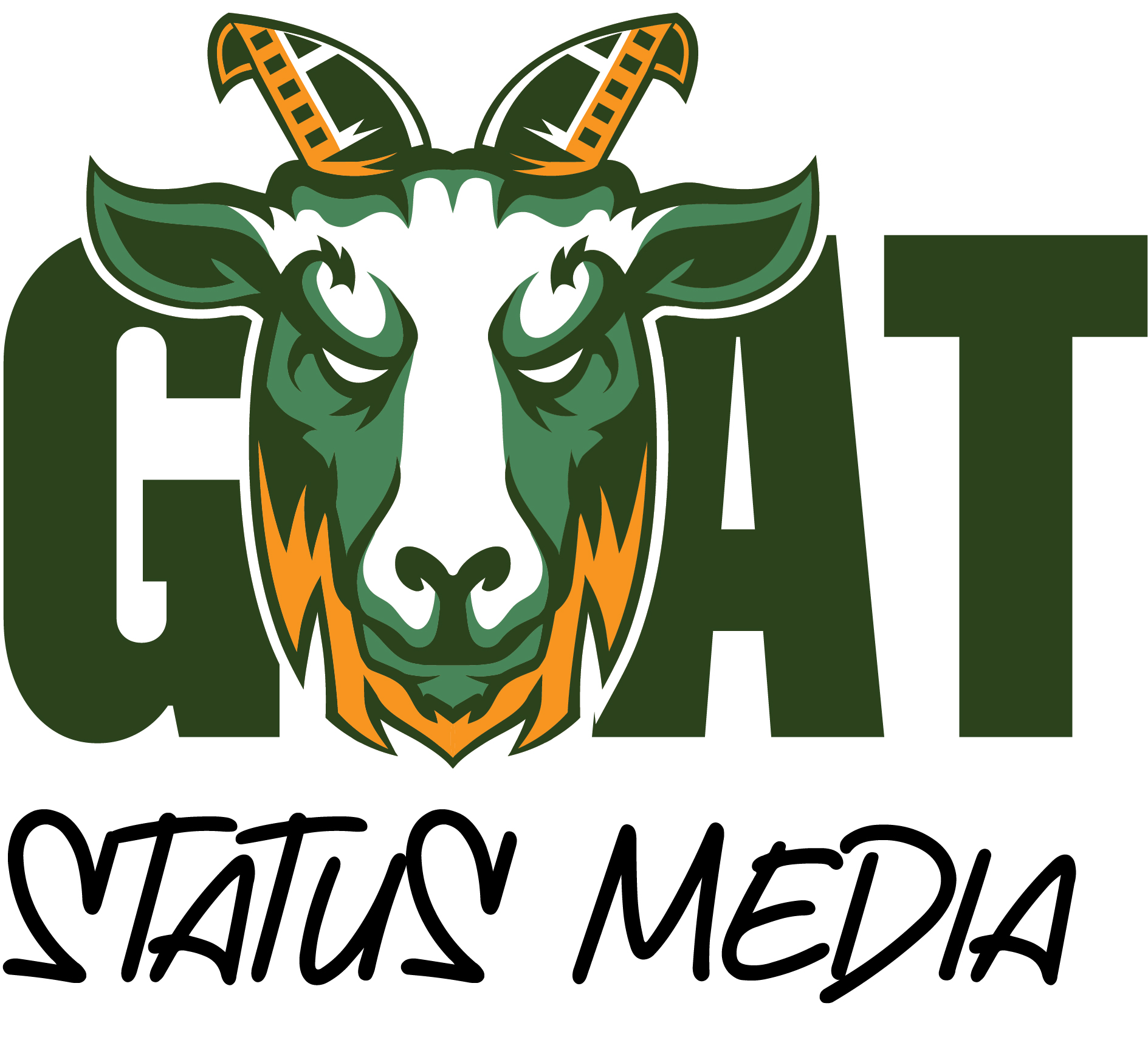
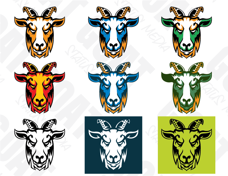
After taking the sketch through Adobe Illustrator and using a series of vector-based Bezier curves to re-illustrate the logo, I was able to present some options for colors and typography based on the client’s desires. Ultimately, they liked the green and orange version, but this wouldn’t be the end of the changes we’d make. Color is very important and is something to be taken seriously. We wanted the colors for GOAT Status Media to show up consistently across print and digital.

Black
Forest Green
Leafy Green
Gold
White


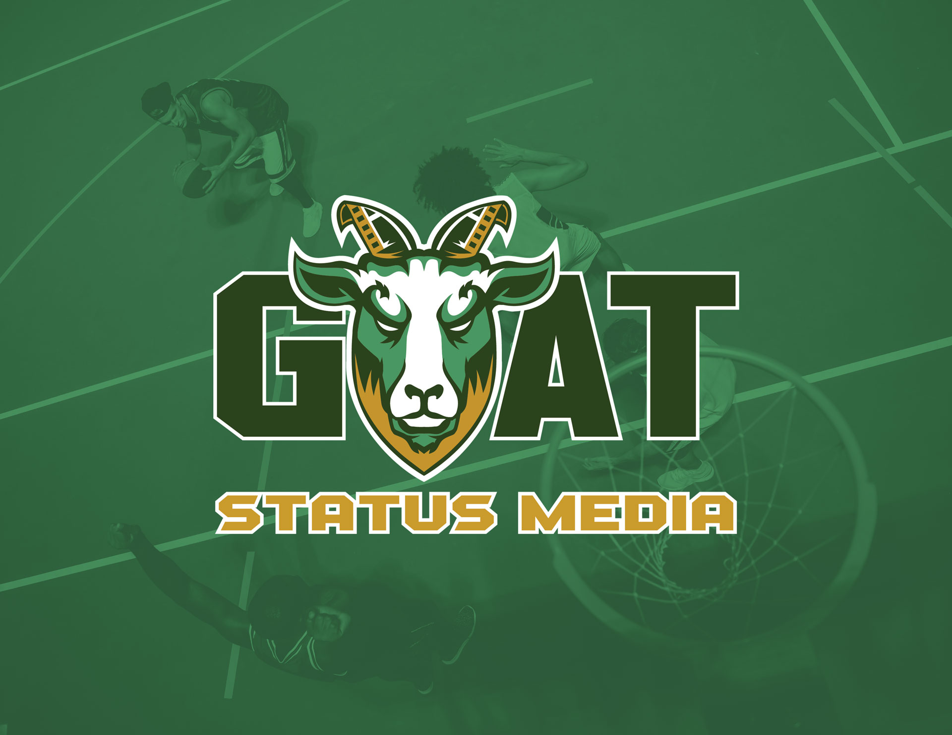
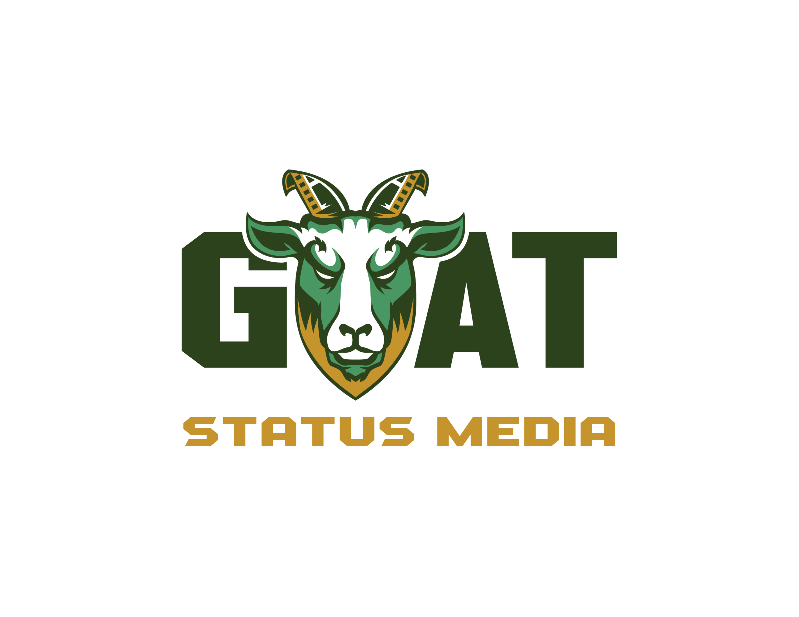
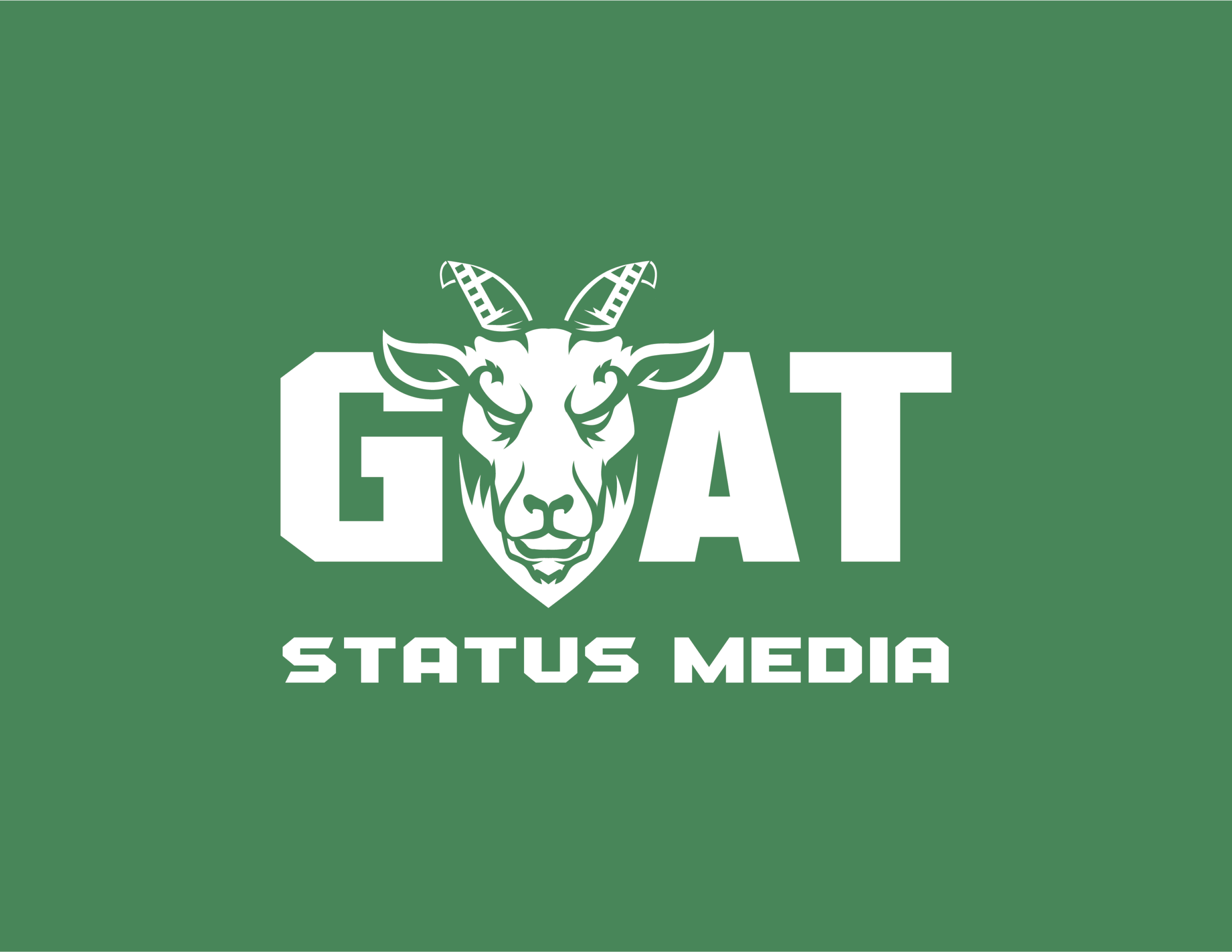
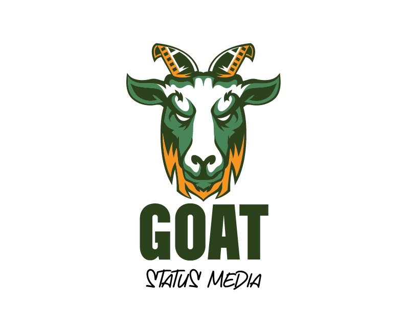
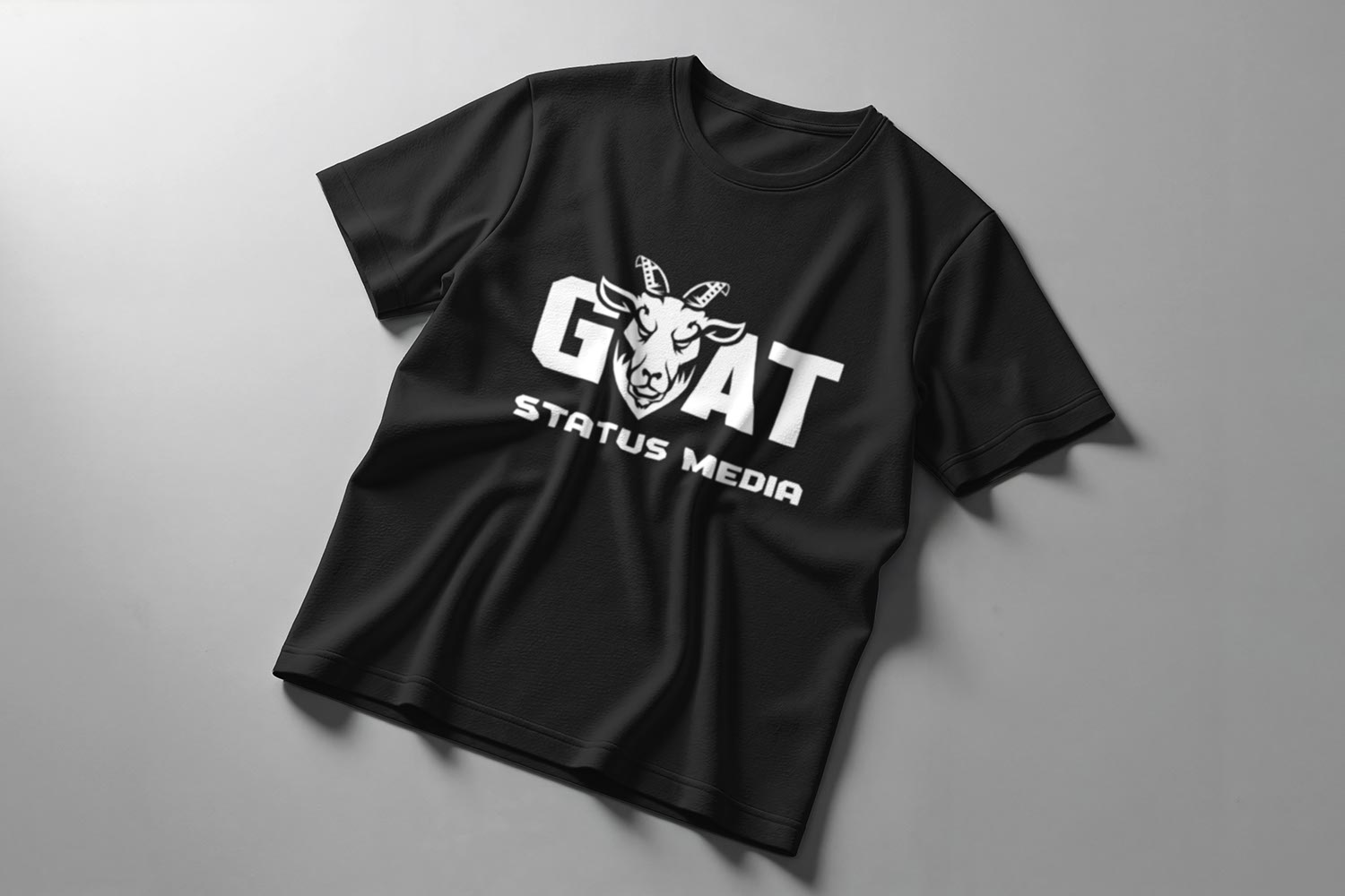
Our final swatches would be forest green, leafy green, and gold. Also, we decided the goat’s face and beard had to be adjusted to feel more intense, but cleaner. The initial design had a hidden “M” for Milwaukee (where the company is based) in a rugged beard, but we moved on, opting for a smoother, almond-like silhouette. With that worked out, I developed GOAT Status Media’s design system, starting by producing the following logo variations: stacked vertical lockup, wordmark, and the media bug.